
Lifestyle
Fawad Hekmaty Explores Color Theory for Graphic Designers: Creating Harmonious Palettes
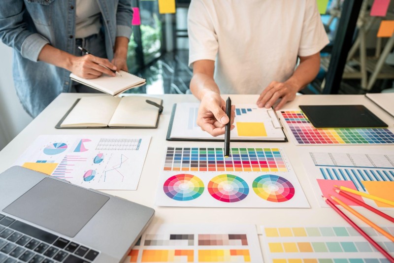
Color theory is a must-have for graphic designers. It helps them create visually pleasant and unified palettes. Understanding color theory principles lets designers effectively send messages and evoke feelings through their work. Colors are crucial for visual graphics. They grab attention and convey meaning. Different colors have different psychological effects on viewers. For example, red and orange induce excitement, while blue and green bring tranquility.
A harmony of colors is also essential. The combination of them looks good and makes a balanced composition. Designers can use complementary or analogous colors to achieve balance. In this exploration, Fawad Hekmaty provides an in-depth understanding of color theory tailored to the needs of graphic designers.
Understanding the Basics of Color Theory
The Color Wheel and Primary, Secondary, and Tertiary
Colors are essential in our lives! Learn the color wheel and its categories: primary, secondary, & tertiary. It helps us to understand the relations between colors.
Primary ones are basic; you can’t create them with other colors. Red, blue, & yellow are examples. Secondary ones are made by mixing two primaries. For example, mix yellow & blue for green, red & blue for purple, and red & yellow for orange.
A tertiary is made by mixing a secondary and a neighboring primary. This gives us many colors. Also, complementary (directly opposite each other) creates contrast. Analogous (adjacent) form harmonious combos and balance. Knowing the wheels is beneficial when selecting a tone for painting, websites, etc. Use it to communicate emotions or messages.
Color Schemes and Their Applications in Graphic Design
They are critical for graphics. Designers can craft pleasing or contrasting arrangements that evoke emotions and communicate messages by selecting and combining hues.
- Monochromatic: Use various colors to create harmony and simplicity.
- Analogous: Adjacent colors form a unified look – perfect for balance.
- Complementary: The opposite color on the wheel makes elements stand out. Ideal for impact or highlighting.
- Triadic: Three equally spaced colors on the wheel drive for a vibrant and energetic scheme.
How to Create Harmonious Color Palettes
Using Complementary Colors for Contrast and Impact
Complementary colors are vital for creating contrast and making a visual impact. You can get dynamic compositions by combining those that are opposite each other on the wheel. Blue and orange or purple and yellow are great complementary selections for producing strong contrast – making certain elements stand out and creating a sense of interest.
Despite being contrasting, it has harmonious properties when used together. You can adjust the saturation to achieve balance. Also, play with the temperature of the hues for further visual interest and depth. When creating your palette, consider the context of your design project. Consider factors such as brand identity, target audience, and emotional response to create a harmonious one.
Using Monochromatic Tones for Subtlety and Simplicity
Monochromatic tones provide a subtle way of creating harmonious palettes. Different tints of one color can be used to achieve a unified look.
- There’s versatility: Endless possibilities for creativity come with using just one color. Depth and interest can be added with shades, tints, and tones.
- Visual harmony: Uniformity of the same hue evokes a sense of calmness.
- Easy coordination: Monochromatic simplifies the decision-making process for coordinating different design elements.
- Creating emphasis: Contrasting colors can draw attention to certain design parts.
- Timeless elegance: These schemes have an elegant and sophisticated look, whether used in minimalist or elaborate designs.
Tips and Techniques
Considering the Emotional and Psychological Effects of Colors
Picking the right hue for your project is about more than just looks. They can have strong psychological and emotional effects shaping the desired outcome. Here are three points to bear in mind when picking them:
- Associations: Different colors can evoke different feelings and associations in people. For instance, blue is often connected to trust and productivity, while red can bring about excitement or caution. Knowing these associations can help you pick the right palette to communicate your message.
- Cultural Influences: They can have various meanings across cultures. White might symbolize purity in Western cultures, but it means mourning in many Asian countries. Taking cultural influences into consideration is vital to ensuring your choices are respectful.
- Contextual Considerations: They can be affected by their surroundings or context. An example is the same shade of green, which can appear tranquil when used in a nature-themed design but will give off a different message when combined with other tones. Thinking about the overall context will help you make harmonious combinations.
Using Color Psychology to Enhance Design Communication
Maximize the impact of color psychology in design with the strategic use of tones. Evoke desired emotions and create a substantial impact on viewers. Understand the psychological effects of them and their cultural connotations. Warm colors like red and orange generate feelings of excitement and energy. Cools like blue and green evoke a sense of calmness and tranquility.
The high contrast between them draws attention and makes certain elements stand out. Low contrast gives a subtle and harmonious look. Be aware of current trends and preferences. Different meanings across periods and industries. Stay updated on evolving trends to ensure designs remain relevant and engaging.
Tools and Resources for Palette Creation
Online Tools and Palette Generators
Online tools and palette generators are invaluable for designers and artists. These resources let them explore combos and create a palette effortlessly. Designers can experiment with colors to find the perfect scheme for their projects. Online tools visually represent colors, making it easier to understand complementary, analogous, and triadic schemes.
Palette generators take this further by suggesting them and creating complete palettes based on one hue. Just input one color, and these generators generate complementary tints that work together. Some online tools have an extra feature – you can adjust saturation levels or apply filters in real time. This lets you preview how your chosen one looks in different lighting conditions or when printed.
When using these tools, consider the context. Bright and vibrant ones might be great for web design but not professional documents or corporate branding. Pastel may be more suitable for art projects or interior.
Useful Websites and Apps for Exploring Palettes
Do you know that using websites and apps for exploring palettes emerged with digital design? Designers needed to streamline their workflow, so tools were created to help them. Nowadays, these tools are an essential part of the designing process.
For finding the perfect palettes for your project, here are five great resources:
- Coolors: A generator with a custom palette and ready-made options. Easy to use and experiment with different hues.
- Adobe Color CC: A library of themes by designers worldwide. It can also extract a palette from an image.
- Paletton: Explore combinations using complementary, triadic, and tetradic schemes. Includes info on each color’s value, saturation, and brightness.
- Color Hunt: A selection of trendy palettes from designers globally. Simple layout and easy navigation.
- Pantone Studio: The official app from Pantone. Access their library and create a custom palette.
Colors Theory is a must-have for graphic design projects. It helps create eye-catching, emotion-evoking designs. To use it effectively, the wheel and its relationships must be considered. Complementary tones, for instance, are opposite on the wheel and make a strong contrast when used together. Analogous colors near each other cause more harmony.


Future Earns 12th Billboard 200 No. 1 Album With The Real Me

Shakira and Burna Boy’s “Dai Dai” Continues Global Chart Reign After FIFA World Cup 2026

Post Malone Debuts New Song During FIFA World Cup 2026 Final Closing Ceremony

Alicia Lacao-Green gains worldwide fame owing to her amazing transformations via make-up and contouring.
Amplifyou, an amazing agency for eCommerce
Vasid Qureshi, India’s Top Blogger Shares 5 Tips to Go Viral on Social Media

Future Earns 12th Billboard 200 No. 1 Album With The Real Me
Future secures his 12th No. 1 album on the Billboard 200 as his newest studio project, The Real Me, debuts...

Shakira and Burna Boy’s “Dai Dai” Continues Global Chart Reign After FIFA World Cup 2026
Although the FIFA World Cup concluded with Spain defeating Argentina on Sunday (July 19), the excitement surrounding football continues to...

Post Malone Debuts New Song During FIFA World Cup 2026 Final Closing Ceremony
Post Malone launched the 2026 FIFA World Cup final celebrations with a performance packed with hit songs, including the live...


Josh Kerr Sets New Men’s Mile World Record at London Diamond League
British middle-distance runner Josh Kerr clocked 3 minutes, 42.66 seconds to establish a new men’s mile world record at the...


BTS “NORMAL” Becomes Spotify’s Most-Streamed K-Pop Music Video in a Single Day
BTS has added another achievement to its growing Spotify record collection. On Friday (July 17), Spotify announced that the group’s...
-

 Lifestyle3 weeks ago
Keith Sanders of Raleigh Discusses the Role of Volunteer Firefighters in Strengthening Local Communities
-

 Entertainment4 weeks ago
BET Awards 2026: List of the Performers and Presenters; Cardi B, Doechii, Tems, and More Set to Perform
-

 Entertainment2 weeks ago
Shakira and Burna Boy’s “Dai Dai” Earns Second Week at No. 1 on Billboard Global Excl. U.S.
-

 Business4 weeks ago
Why Off-Price Retail Keeps Gaining Ground: Lessons From Salomon Murciano
-
Real Estate4 weeks ago
How Estate Agents in Hale Help Homeowners Sell Their Property With Confidence
-

 Sports3 weeks ago
Wimbledon Championships 2026: How to Watch Live, Schedule and Where to Watch Live Without Cable on TV
-

 Travel4 weeks ago
How to Get a USA Visa Faster: Tips to Speed Up Approval in 2026
-
Real Estate4 weeks ago
Why More UK SME Owners Are Choosing Portugal as Their European Business Base