
Tech
PayPal Updates its Brand Identity with a Bold New Look, Refreshed Font, and Logo

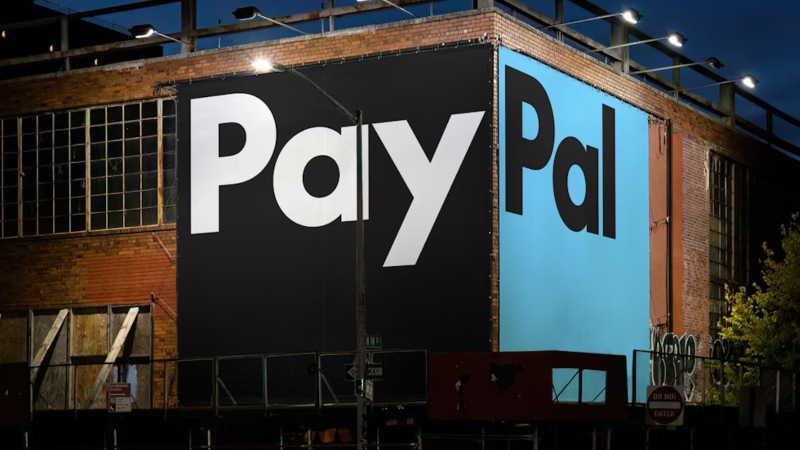
PayPal, a financial technology company, has updated its brand identity as the company enters a new era and moves in a new direction for the business.
PayPal has pioneered new and exciting international business practices for more than 25 years. As per Pentagram, the company behind the rebrand, the digital payment platform is now conducting a new era for customers by making it simpler for customers to shop and pay with PayPal from any location at any time.
As per the report, Pentagram partner Andrea Trabucco-Campos and his team developed a new identity as part of this evolution. This refreshed identity unifies the PayPal brand and conveys the company’s mission to revolutionize commerce on a global scale.
The system includes a motion language based on common payment actions like tapping, flipping, and swiping, a brand-new bespoke typeface, a simplified color palette, and PayPal Pro.
In the beginning, Pentagram and PayPal worked together to build a visual and strategic foundation for the brand identity that would help the company transform into a product or service that is more accessible to everyone.
These guiding principles have been developed to make PayPal more accessible to “Everyone, everywhere.” These principles include simplicity, optimism, and trust.
It was stated that the brand identity derives its strength from a visual language that is bold, open, and direct, as well as flexible enough to welcome brand partnerships and collaborations.
Additionally, the iconic PayPal monogram has been redrawn to be more sharp and modern. The angle of the layered letters in the updated mark stays the same, but the curves at the letterform’s corners have been de-rounded to make them appear sharper.
To give the layers of the logo a sense of depth and dimension that were not there before, the colors have been calibrated for continuous contrast. Venmo blue appears when bright blue and deep blue overlap, referring to PayPal’s expanding mobile app.
Despite the monogram’s connection to the accompanying logotype, it stated that the monogram’s layout remained unchanged. To improve the identity’s appearance and make it simpler to adapt to new circumstances, the symbol is no longer limited to the wordmark.
Through their simplicity, the two elements now function independently of one another, opening up more possibilities.
The foundation of the identity is the new PayPal wordmark, which is set in a new custom typeface called PayPal Pro that embodies the brand’s boldness, confidence, and clarity.
PayPal Pro is a customized version of Lineto Type Foundry’s LL Supreme, a contemporary take on Futura. Futura, originally designed by Paul Renner in 1927, is a geometric sans serif influenced by lettering proportions from almost 2,000 years ago.
The typeface keeps the attention on the message because of its timeless, universal shapes. Similarly, PayPal Pro aims to be entirely constructed of circular curves and straight lines. Pentagram is likewise working intimately with Lineto and PayPal to develop a secondary typeface, PayPal Pro Text, that is enhanced to perform at small sizes for legibility and utility, it said.
According to Pentagram, the new logo stands out from the blue that has come to be associated with fintech because of the timeless type and neutral black and white palette. Blues, on the other hand, serve as the brand’s energy and accent colors. The yellow from the previous palette, which was a duplication of other retail brands, is also removed by the system. The outdated yellow payment buttons have been replaced with black ones as part of this update to the user interface.
The simplified palette enables PayPal to dial up its brand personality in color-saturated imagery. The new photo direction demonstrates how simple it is to use the platform in authentic, real-life situations. and spontaneous.
The motion language of the identity draws inspiration from everyday digital and physical payment-related gestures and behaviors to emphasize PayPal’s ease of use. With taps, clicks, flips, and swipes, brand animations bring the movement of the product experience into the identity itself by activating the wordmark and typography.
On the rebrand, the Pentagram team worked closely with PayPal’s internal communications, marketing, and advertising teams as well as Diego Scotti, executive vice president and general manager of PayPal’s consumer group and global marketing and communications, and Geoff Seeley, PayPal’s chief marketing officer.
Pentagram and PayPal also coordinated the entire implementation of the new system, including a Will Ferrell-starring BBH Global advertising campaign.
According to the announcement, the expanded design system will include additional brand expressions that will be released alongside the new PayPal Debit Card.












“My Trip Is Only for Three Days”: Do You Still Need Travel Insurance?

Apple Prepares iOS 27 Release With AI-Powered Siri and Expanded Apple Intelligence

Best Commodity Trading Platforms in India for Trading Crude Oil and Natural Gas Derivatives

Alicia Lacao-Green gains worldwide fame owing to her amazing transformations via make-up and contouring.
Amplifyou, an amazing agency for eCommerce

Vasid Qureshi, India’s Top Blogger Shares 5 Tips to Go Viral on Social Media

“My Trip Is Only for Three Days”: Do You Still Need Travel Insurance?
A three-day trip can feel too short to need much preparation. You book the flight, choose a hotel, pack light...
Apple Prepares iOS 27 Release With AI-Powered Siri and Expanded Apple Intelligence
Apple is getting ready to roll out iOS 27 to supported iPhone models, bringing an AI-enhanced Siri, expanded Apple Intelligence...

Best Commodity Trading Platforms in India for Trading Crude Oil and Natural Gas Derivatives
Crude oil and natural gas are among the most actively traded commodity derivatives in India. They are also among the...


How to Use Corporate and Personal Health Insurance Together
Corporate health insurance can provide useful medical cover during employment, while a personal plan offers greater control and continuity over...


Personal Accident Insurance for Daily Commuters and Two-Wheeler Riders
Daily travel may feel routine, yet every commute involves changing traffic, busy roads, sudden braking and unpredictable weather. Two-wheeler riders...
-
 Sports3 weeks ago
Concacaf Nations League 2026/27: Groups and Schedule
-
Business4 weeks ago
Black Banx H1 2026 Results Reveal the Power of Operating Leverage
-
 Sports6 days ago
2026 FIBA Women’s Basketball World Cup Games and Schedule
-
 Festivals & Events3 weeks ago
Gamescom 2026 Opening Night Live: Schedule, Date, Streaming Details, Expected Games and How to Watch
-

 Tech3 weeks ago
YouTube View Count Changes: What Creators and Marketers Need
-

 Science2 weeks ago
Sturgeon Moon 2026: When and How to See August 28 Full Moon
-
 Business2 weeks ago
Gastauer Family Office Connects Financial, Natural and Cultural Capital Through the Gastauer Foundation
-

 Business3 weeks ago
The Business of Building a Brokerage for the Long Term